a taste-driven brand experience built for discovery and delight
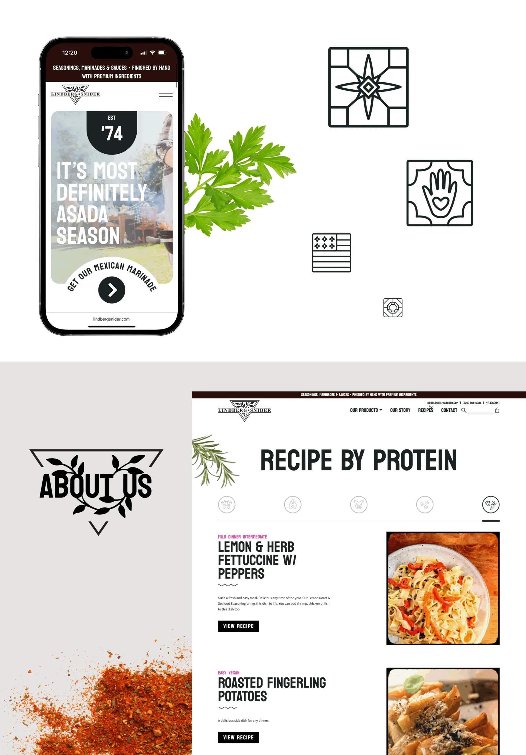
Lindberg Snider goes online — and enters a new era of connection. They came to us ready to bring their heritage brand into modern digital life: an online shopping experience, a hub for recipes and product education, and a clear pathway for wholesalers to reach them.
We transformed their presence with intentional design, thoughtful storytelling, and a digital system built to feel as warm and crafted as the food itself.
70%
of family businesses don't survive succession. Digital readiness ups the odds.
revenue channels: consumer e-commerce and wholesale reach
Heritage shouldn't mean stuck in the past
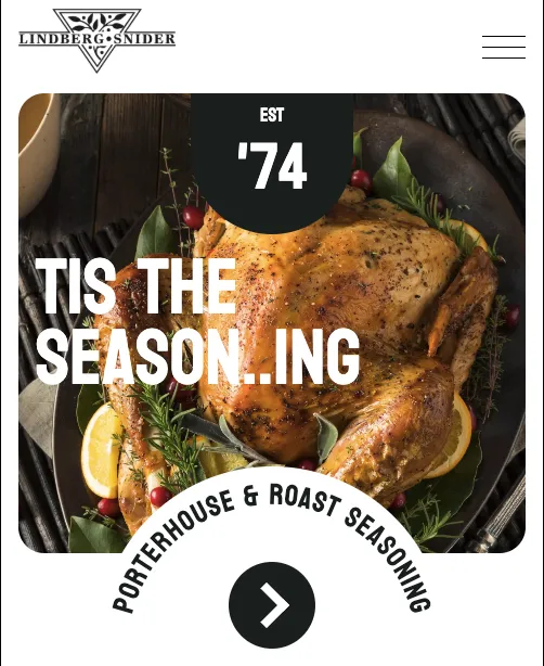
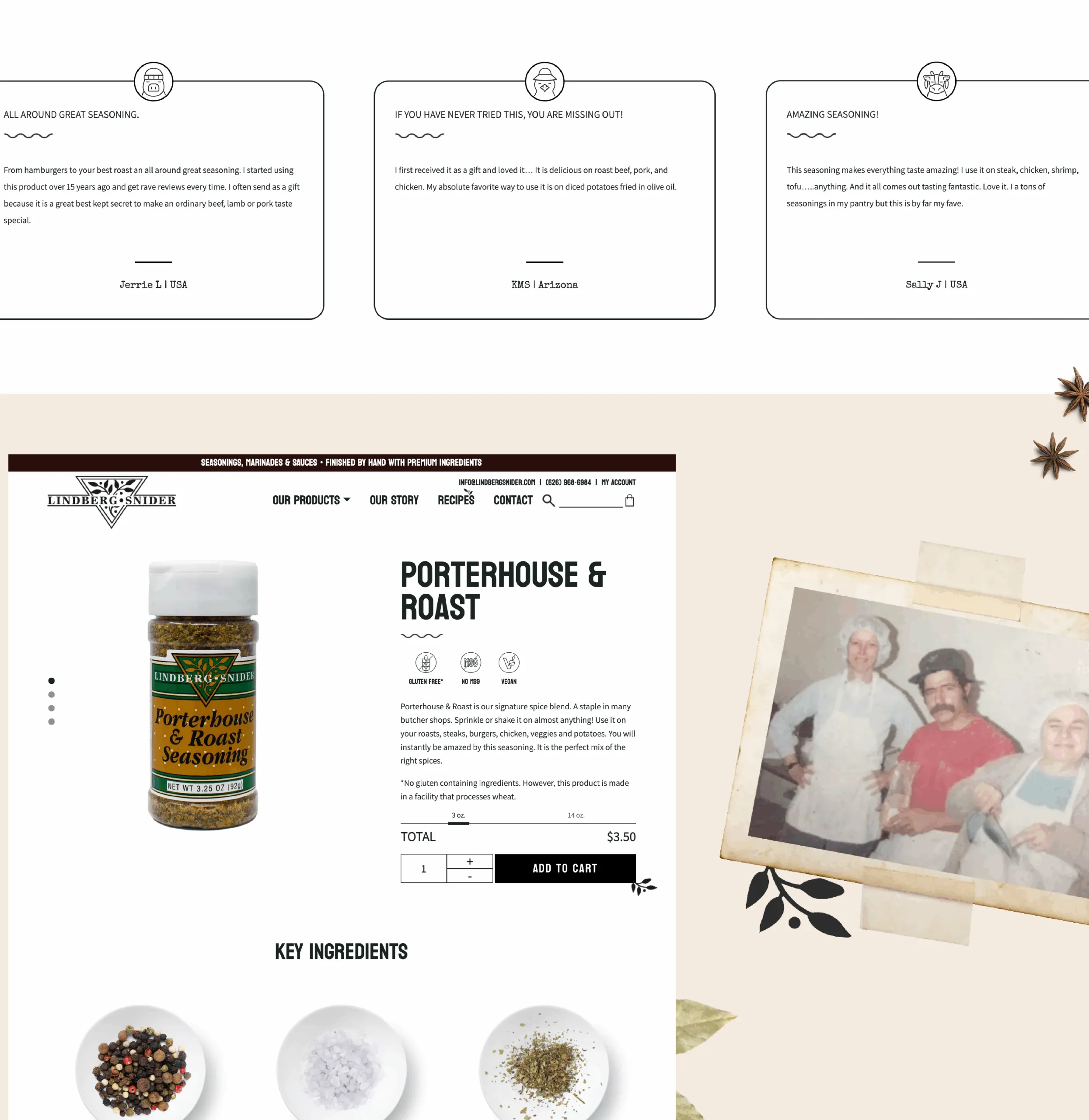
Modern commerce meets vintage charm — brought to life with clean UX, appetizing visuals, and a content strategy built for repeat visits.
VEGA award winner, best website, Food & Beverage
VEGA Award Winner, Best User Interface, Website & Mobile Designs
The approach
Bringing a heritage brand into the digital era — without losing what makes it special
Our approach centered on translating the brand’s culinary craft into an online experience built for both exploration and efficiency. We guided decisions like adding recipes to drive engagement, designing a clear pathway for wholesalers, and defining a visual world that feels warm, flavorful, and rooted in their story. It’s a system that honors tradition while fully embracing how people shop and cook today.
We built a visual language inspired by classic kitchen culture — warm terracotta, herb greens, clean whites, and subtle textures that echo recipe cards and vintage packaging. Custom illustrations of herbs, ingredients, and simple culinary gestures add charm without feeling nostalgic for nostalgia’s sake; they act as little moments of appetite and warmth woven through the experience.
The brand voice mirrors that energy: friendly, informed, and rooted in craft. We shaped product descriptions, recipe intros, and microcopy that invite people in, encourage experimentation, and highlight the care behind every item. The tone remains confident and culinary, never fussy — the kind of brand you trust in your kitchen.
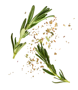
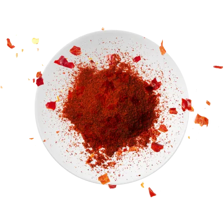
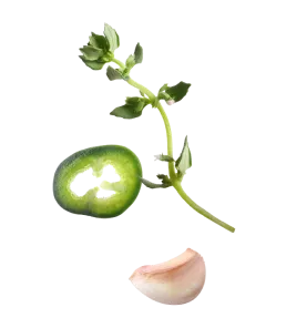
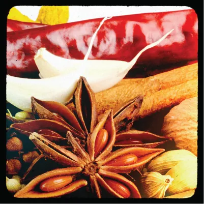
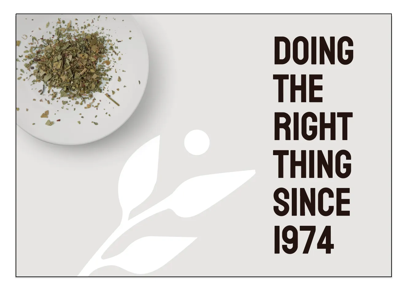
Visually, we wanted to honor the brand’s position as taste buds to all they’ve met and served since ’74. The recipe filters add a little wink to the experience — custom iconography feels beautiful and storied, honors the era of the logo, and makes choosing what to cook feel effortless and a touch playful. Ingredient photography is treated with care: dimensional spices, herbs, and marinades that feel real, textured, and ready to use.
Clean layouts and bright, kitchen-ready whites keep everything feeling fresh and easy to shop. It all comes together in a way that feels inviting and practical — a place where people naturally want to browse, cook, and come back for seconds.